8.5 minute read
Basics of Website Designing for Beginners
Creating a website might seem daunting, especially if you’re just starting out. But with the right approach and understanding of basic design principles, anyone can design a functional and visually appealing website. Whether you’re a business owner, a marketer, or someone looking to build a personal portfolio, knowing the fundamentals of website design is key to developing a user-friendly and effective site.
In this guide, we’ll break down the basics of website designing for beginners so you can confidently build a site that engages visitors and serves your goals.
Define Your Purpose and Audience
Before diving into design, it’s essential to understand the purpose of your website. Are you creating an online store, a blog, or a portfolio? Your site’s purpose will dictate its structure, design elements, and content.
Additionally, understanding your target audience is crucial. Who are they, and what are their needs? Designing with your audience in mind ensures you create a user-centric experience that addresses their expectations and pain points.
Choose the Right Website Platform
For beginners, picking the right platform is key. Popular website builders like WordPress, Wix, or Squarespace offer user-friendly templates and drag-and-drop functionality, making it easy to design without needing advanced technical skills. Each platform has its strengths:
-
WordPress
Highly customizable, ideal for blogs, portfolios, and businesses looking to scale.
-
Wix
Great for small websites with limited content and e-commerce options.
-
Squarespace
Excellent for creatives, offering sleek templates for portfolios and service-based businesses.
Your choice depends on your needs, so explore each option before committing.
Focus on Layout and Structure
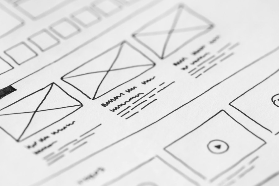
A website’s layout is the foundation of good design. It determines how information is presented to visitors. For beginners, simplicity is key:
-
Header
Includes your logo, navigation menu, and possibly a call-to-action (CTA) like “Get Started” or “Contact Us.”
-
Body
The main content area where you showcase your products, services, or blog posts.
-
Footer
Usually includes links to essential pages like contact info, terms of service, and social media.
Stick to clean, simple layouts that guide users easily through the site. Make sure the navigation is intuitive, so users don’t have to think hard about how to find what they need.
Choose the Right Colors and Typography
Color and typography are vital to the look and feel of your site. Choosing the right color scheme can affect how users perceive your brand. Here are some beginner tips:
-
Limit Your Palette
Stick to two or three main colors—usually a primary color, a secondary color, and a background color.
-
Contrast is Key
Ensure there’s enough contrast between your background and text colors to enhance readability.
Typography also plays a significant role in readability and design aesthetics. Choose easy-to-read fonts for body text (like Arial, Roboto, or Open Sans) and a more distinct font for headings to create a visual hierarchy.
Optimize for Mobile Devices
With over half of global web traffic coming from mobile devices, it’s critical that your website is mobile-friendly. Most modern website platforms come with responsive design templates that automatically adjust your site’s layout based on the screen size. To ensure a good mobile experience:
-
Use responsive images and media
Images should scale down without losing quality.
-
Keep navigation simple
Make sure buttons and links are large enough to be easily tapped on mobile devices.
-
Test on multiple devices
Before launching your site, check how it looks and functions on smartphones and tablets.
Use High-Quality Images and Multimedia
Visuals are one of the first things users notice when visiting a website. Make sure to use high-quality images and videos that align with your brand. Consider the following:
-
Image Resolution
Low-resolution images can make your site look unprofessional.
-
File Sizes
Compress images to keep your site loading fast while maintaining quality.
-
Videos
Use short, engaging videos to explain your product or service, but ensure they don’t slow down the site.
There are plenty of free stock image websites like Unsplash or Pexels where you can find professional images to enhance your design.
Ensure Easy Navigation
Navigation is a critical component of website design. Users should be able to find what they’re looking for quickly and effortlessly. Here’s how to make navigation user-friendly:
-
Keep the Menu Simple
Include only the essential pages in your primary navigation (like Home, About, Services, Contact).
-
Use Breadcrumbs
These provide a trail of links, showing users where they are within your site’s structure.
-
Add a Search Bar
For larger websites with lots of content, a search bar can help users find specific information quickly.
Focus on User Experience (UX)
User experience (UX) is about making sure your website is easy and enjoyable to use. Some UX basics for beginners include:
-
Fast Loading Times
Users are impatient. If your site takes too long to load, they’ll leave. Use tools like Google PageSpeed Insights to check and improve your site’s speed.
-
Clear Calls to Action
Whether it’s “Sign Up Now,” “Learn More,” or “Get Started,” every page should have a clear call to action (CTA) that guides users toward your goal.
-
Consistency
Use consistent colors, fonts, and design elements across your site for a polished, professional feel.
Test and Optimize
Designing a website doesn’t end once it goes live. Regularly test and optimize your site based on how users interact with it. Use tools like Google Analytics to track user behavior, see which pages are performing well, and identify any areas that need improvement.
Common areas for testing and optimization include:
-
Page Load Speed
Keep improving it by compressing images and minimizing code.
-
Conversion Rates
Track how many visitors are converting (e.g., signing up for a newsletter or making a purchase) and optimize your CTAs and forms to improve results.
-
Usability
Gather feedback from users on the ease of navigation and functionality.
Conclusion
Mastering the basics of website designing doesn’t require advanced skills—just a willingness to learn and apply core principles. By focusing on simple layouts, mobile optimization, high-quality visuals, and user-friendly navigation, you can create a website that not only looks good but also delivers a great user experience.
Whether you’re building a website for your business or personal use, these tips will help you create a professional, functional, and engaging site that can grow and evolve as your needs change.

